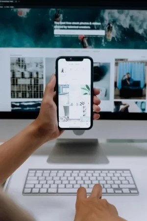
Are you planning on setting up your mobile friendly site for Android, iPhones and Samsung Galaxy users?
Here are 10 ways to make a mobile friendly site.
- Be Minimalistic — A flashy website is not going to translate well on a mobile device. Stick to the basics, and remember the acronym you’ve learned before. K.I.S.S. (Keep it simple silly)
- Consider how mobile readers see your content — Check for yourself on the mobile device that you are targeting with your content to assure yourself that the mobile content website translates well to the device. You can’t be sure without looking.
- Cut down on ad clutter — You may find that you need to move your ads to other areas that work better with mobile devices. Having ads in the middle of content might not work well with a mobile device like they do on a regular website.
- Detect platforms that are viewing with proper coding — Learn about special coding that you can do for your content so that it detects what device is looking at the site, and appears in the best format for that device.
- Lots of navigation — For a mobile device you likely need more navigation than on a website. Consider using shorter drop down menus for a mobile friendly site, and think of ways to drill down to the minute information on your site with more menus.
- Make short links – As we know, typing on a handheld device is not fun or easy. So make links as short as possible so that no one throws their mobile device across the room in frustration when trying to view your site. TinyURL is a great site to create short links and a great tool for mobile marketing.
- One post or set of content per page — this goes back to being minimalistic but keep the content to one post per page for easier viewing.
- Put content front and center — Instead of having an entry page, put the newest content front and center so that mobile content viewers see what is important right away.
- Put links under content and within — reconsider how you put textural links within a post. While this is great for a website viewed on a web page it might work better to put links under the post as well as within the text for easier navigation for a mobile friendly site.
- Use drop down navigation or hover navigation – This type of navigation saves a lot of space on the mobile device and makes it easier to actually click it to move to the mobile content that the visitor wants to view.

When setting up your new website, keep in mind you are setting up the site for both laptop and phone users. Use the above steps to create a mobile friendly site, and you will be set for the Google Pixel, Android, iPhone and Samsung Galaxy community of users.


